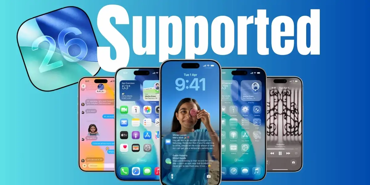
Apple rolled out its brand-new Liquid Glass UI in iOS 26, promising a sleek, futuristic design that blends icons, backgrounds, and system elements with fluid transparency and reflective layers. On the surface, it looks stunning—shiny panels, blurred glass effects, and floating elements give the interface a completely refreshed aesthetic. For a moment, it feels like using something straight out of a concept video.
But once the initial “wow” factor fades, many users are realizing just how impractical this design can be. The biggest complaint? Terrible contrast and accessibility issues. Notifications, banners, and even some system tabs often blend into the background, making the text incredibly hard to read. When everything is semi-transparent and glowing, basic UI clarity suffers. This isn’t just nitpicking—it’s a major problem for people who rely on clear visual separation to navigate their phone quickly and accurately.
Even more surprising, these contrast issues showed up during Apple’s own keynote showcase. Some of the cherry-picked demo screens displayed overlapping colors and blurred panels where text nearly disappeared. That raised an obvious question among users: if it looks this bad in a controlled presentation, how will it perform in real-world use with custom wallpapers and everyday lighting conditions?
Critics are comparing Liquid Glass to the old Windows Aero concept—beautiful but impractical. It creates a glossy illusion at the cost of usability. Half the text can look unreadable, and small UI controls get lost in the visual noise. Accessibility advocates have already called out the design for ignoring legibility guidelines.
To be fair, some parts of the redesign work well. Icons look sharp, and subtle blur layers around widgets add depth without being distracting. But overall, the system feels like form took priority over function—and users are frustrated.
Until Apple addresses these issues in future updates, Liquid Glass risks becoming more of an aesthetic experiment than a practical UI upgrade.
Pros vs Cons of Liquid Glass UI in iOS 26
| Pros | Cons |
|---|---|
| Fresh, futuristic design | Poor contrast on many UI elements |
| Beautiful glass-like transparency effects | Major accessibility issues for low-vision users |
| Icons look sharper and more refined | Text often blends into background (hard to read) |
| Adds depth to widgets and panels | Notifications and tabs appear washed out |
| Creates a premium, modern aesthetic | Inconsistent legibility across different wallpapers |
| Looks visually striking in demos | Prioritizes form over real-world usability |
What Users Want Apple to Fix Next
While the Liquid Glass UI brings a bold new look to iOS 26, users are already voicing what they hope Apple addresses in upcoming updates. The number one request is improved contrast and legibility. Many want a simple toggle to reduce transparency and increase background opacity for text-heavy areas like notifications, banners, tabs, and Settings panels.
Accessibility advocates are also pushing for stronger color contrast compliance, ensuring that system text and icons remain visible against any wallpaper or background. A few users have suggested adding a “Classic Mode” or “High Contrast” theme, which would preserve the new design language but strip away the heavy blur and glass layers for better clarity.
Another common request is more customization controls—letting users dial up or down the intensity of blur and transparency effects across the system. Right now, it feels like an all-or-nothing design, leaving no middle ground for people who like the new style but struggle with its usability.
If Apple delivers on these improvements, the Liquid Glass UI could strike the perfect balance between style and functionality. But until then, many iOS 26 users are stuck with a design that looks futuristic yet feels frustrating in daily use.


