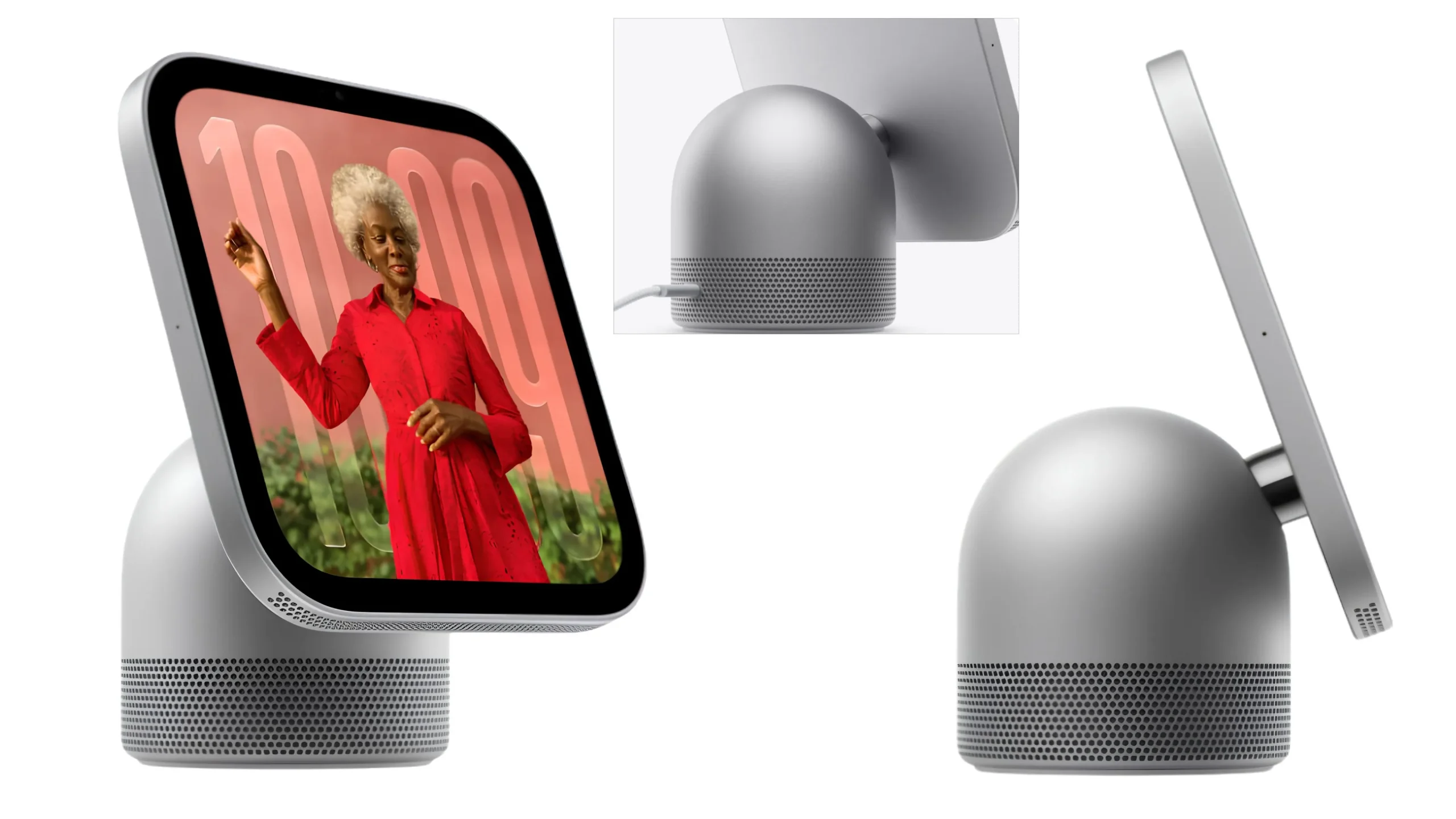
Choosing the right color for your new Apple HomeView isn’t just about personal preference. Since HomeView is designed to become part of your living space, the color you choose can make a big difference in how it looks alongside your furniture, walls, and other Apple devices.
With four attractive color options—Silver, Starlight, Rose Pink, and Space Gray—there’s a style for almost every home.
But which Apple HomeView color is the best choice for you? Let’s compare all four colors and help you decide before placing your order.
1. Silver – Best for a Classic and Minimalist Look
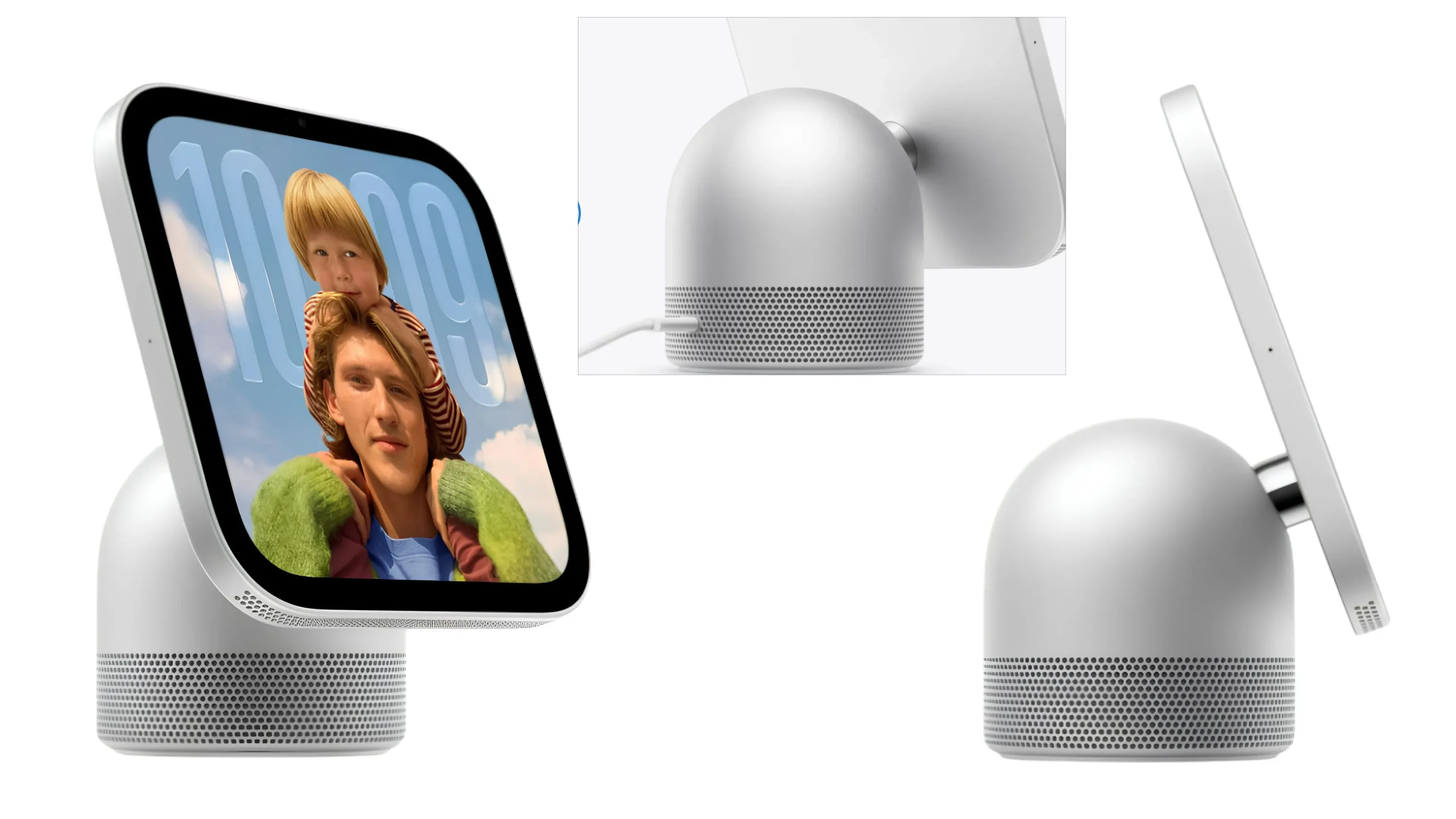
Silver is an excellent choice if you prefer Apple’s signature clean and timeless design.
Its neutral appearance works particularly well in modern homes, minimalist interiors, and spaces with white or light-colored furniture.
Why choose Silver?
- Classic Apple-inspired appearance
- Pairs beautifully with white, gray, and neutral interiors
- Easy to coordinate with other Apple devices
- A versatile choice that won’t look outdated quickly
Best for: Minimalist living rooms, modern kitchens, home offices, and anyone who prefers a simple, sophisticated look.
Our verdict: If you’re unsure which color to buy, Silver is one of the safest choices.
2. Starlight – Best for a Warm and Elegant Home
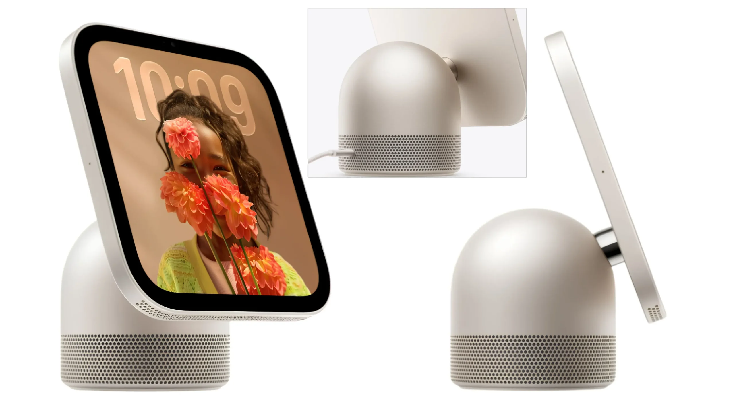
If Silver feels a little too plain, Starlight offers a softer, warmer alternative.
Its subtle champagne-inspired appearance can complement cream-colored walls, wooden furniture, and warm interior lighting.
Why choose Starlight?
- Soft, elegant appearance
- Complements beige, cream, and warm-toned interiors
- Offers a more distinctive look than traditional Silver
- Ideal for creating a cozy atmosphere
Best for: Bedrooms, warm-toned living rooms, and homes with wooden furniture or neutral decorations.
Our verdict: Starlight is a great option if you want something elegant without choosing a bold color.
3. Rose Pink – Best for a Stylish and Eye-Catching Setup
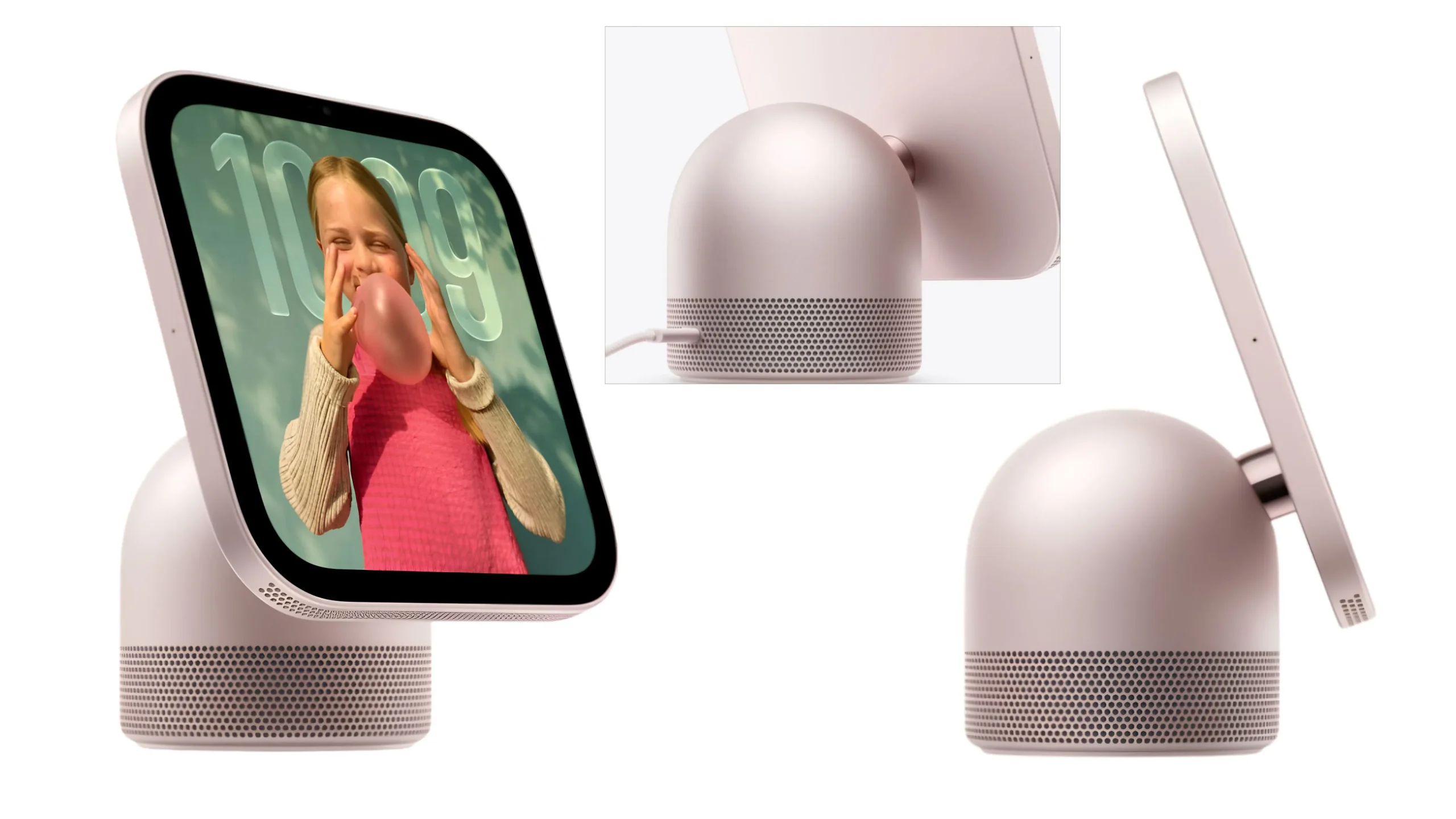
Want your Apple HomeView to stand out? Rose Pink is worth considering.
This color adds a playful yet sophisticated touch to your space, especially if you enjoy pastel accessories and modern home decorations.
Why choose Rose Pink?
- Fresh and stylish appearance
- Adds personality to your home setup
- Complements white, beige, and pastel interiors
- Great for anyone who prefers something different from traditional technology colors
Best for: Bedrooms, creative workspaces, stylish desks, and pastel-themed interiors.
Our verdict: Rose Pink is the most expressive option of the four. It’s an excellent choice if you want your HomeView to become a decorative accent.
4. Space Gray – Best for a Bold and Premium Look
Space Gray is a strong choice for anyone who loves dark-colored Apple products.
Its deeper finish creates a modern, understated appearance that works particularly well alongside dark furniture, black accessories, and contemporary interior designs.
Why choose Space Gray?
- Sleek, modern appearance
- Complements dark furniture and accessories
- Blends naturally into darker entertainment setups
- Offers a professional, understated style
Best for: Modern living rooms, home entertainment areas, offices, and darker interior themes.
Apple HomeView vs. HomeView Wall Mounted: Color Availability
Before choosing your favorite finish, there’s one important difference between the two models.
| Apple HomeView Color | Ideal Interior | Style |
|---|---|---|
| Silver | White and neutral rooms | Classic |
| Starlight | Cream and wooden interiors | Elegant |
| Rose Pink | Pastel and creative spaces | Playful |
| Space Gray | Dark and modern rooms | Premium |
| Model | Available Colors |
|---|---|
| Apple HomeView (Tabletop) | Silver, Starlight, Rose Pink, Space Gray |
| Apple HomeView (Wall Mounted) | Silver, Space Gray |
Our verdict: Space Gray is our favorite for a bold, modern setup that looks sophisticated without drawing too much attention.